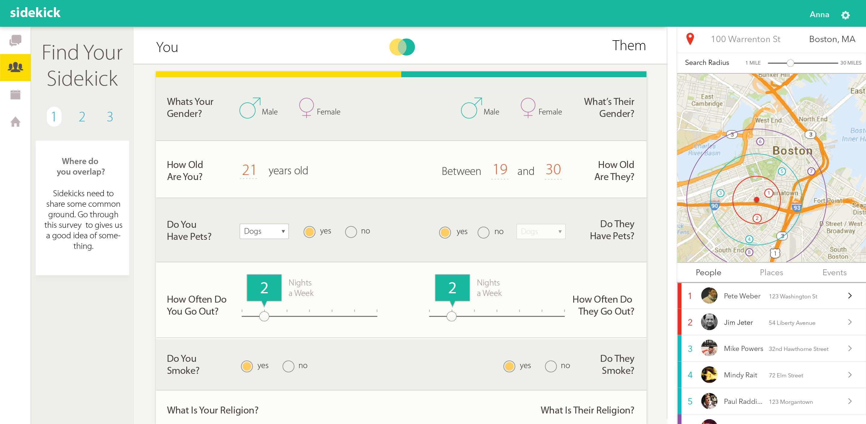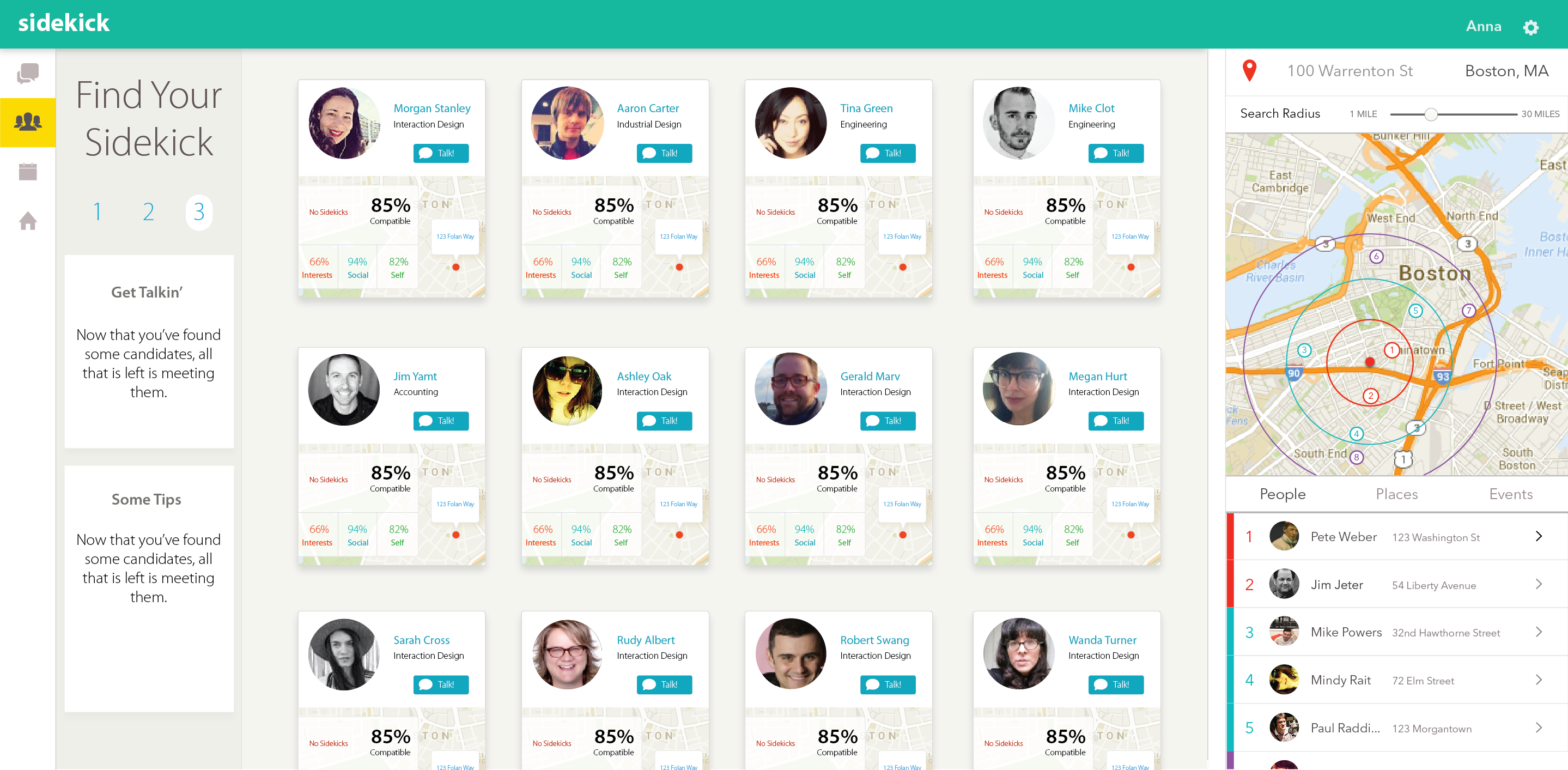
A Network for Temporary Housing
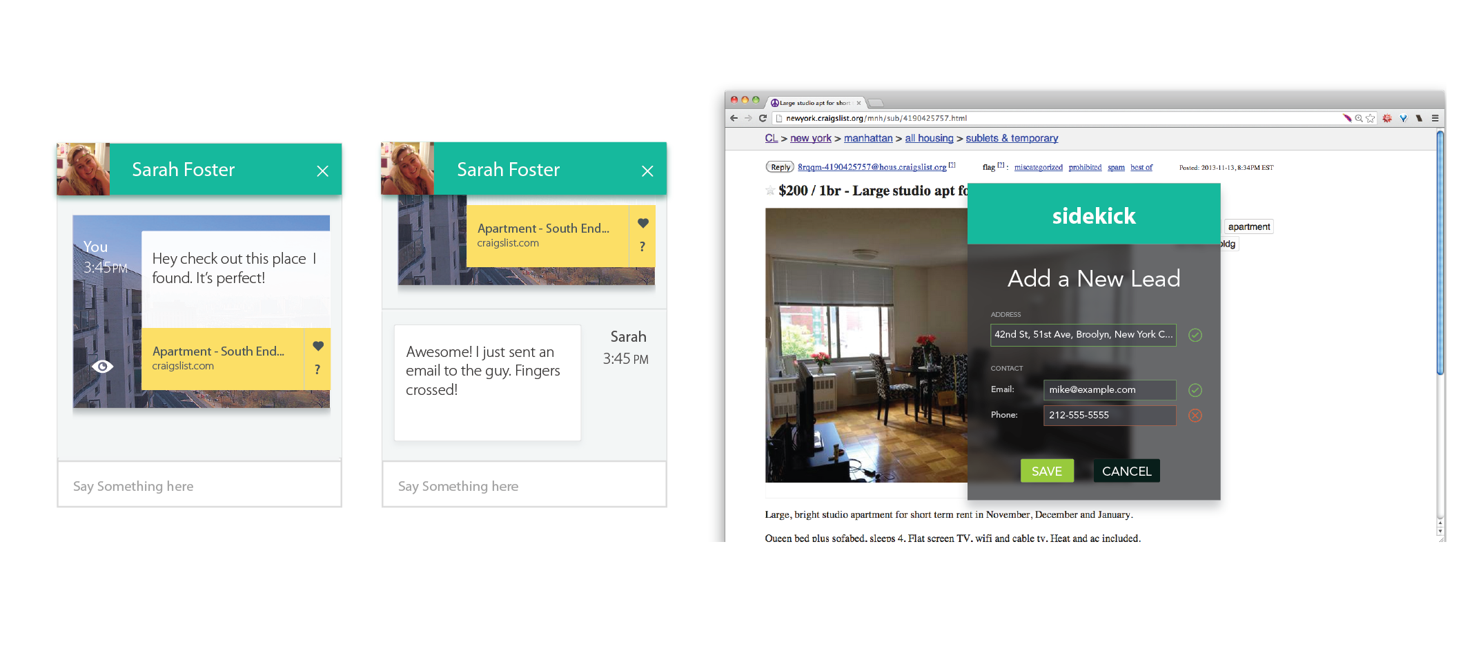
Sidekick is a product that connects people who are temporarily relocating. It aims to fill a niche where existing services, such as Craigslist, Facebook, AirBnB, and PadMapper, all fail. Namely, getting a person situated in an unfamiliar locale.
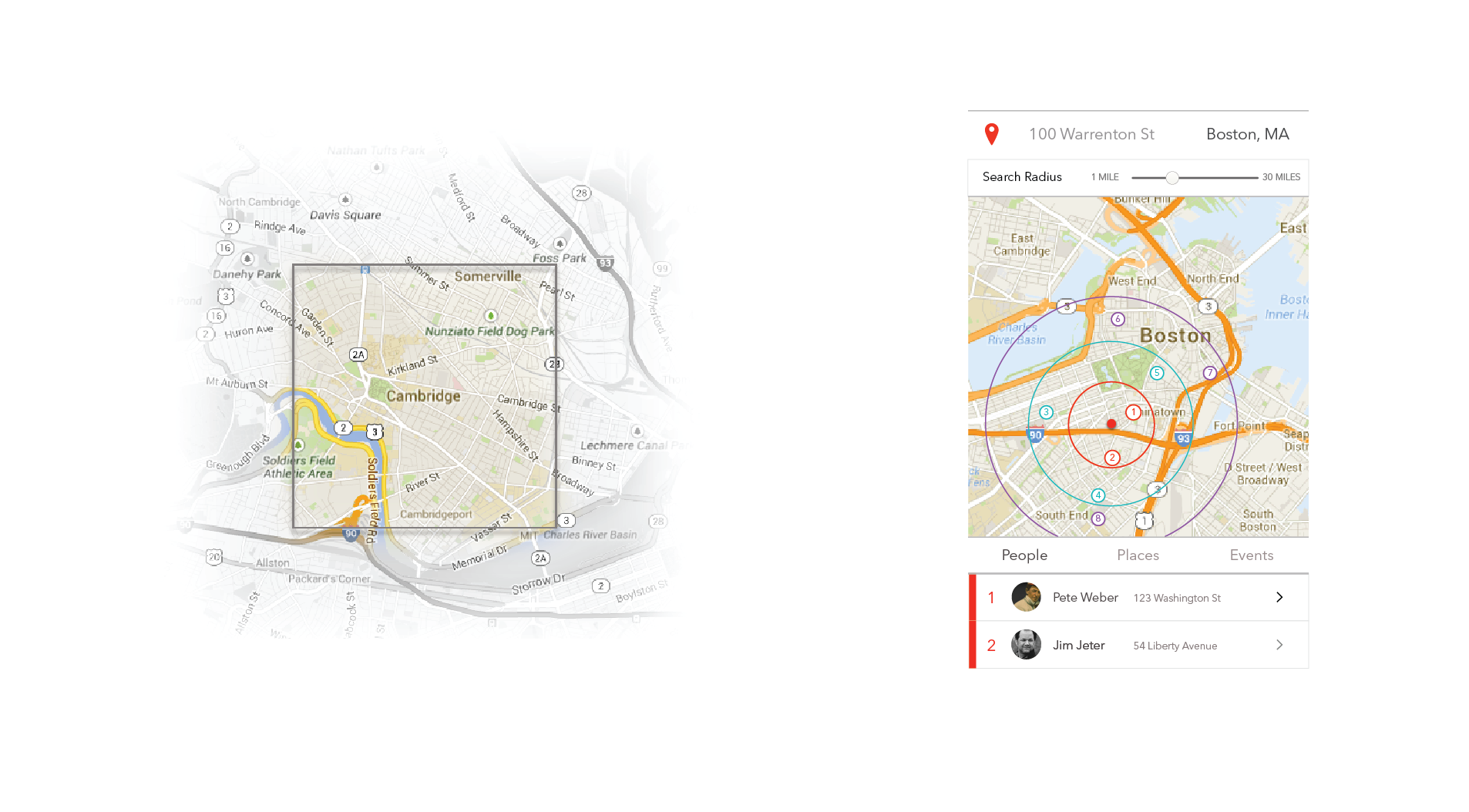
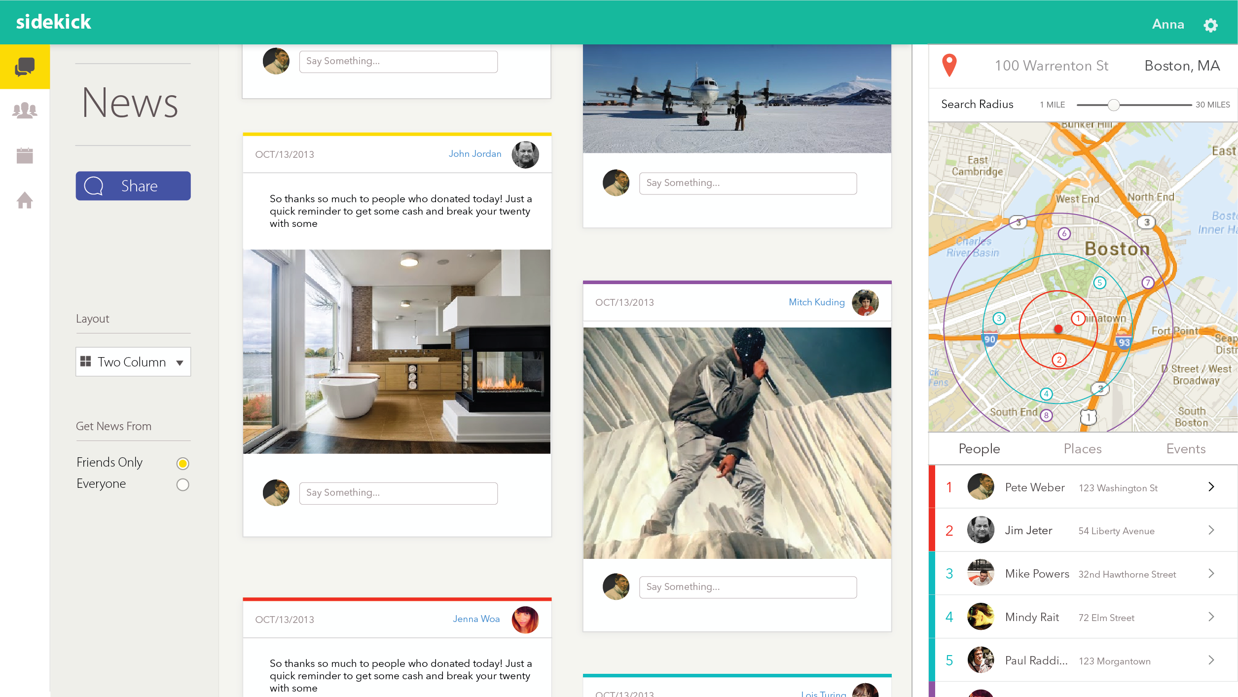
This product includes many features familiar to many internet users, introduces the concepts of a "sidekick" and a "sliding network window", to make it particularly useful for our target audience.
Research
This project was an exercise in project management, user-centered design, interaction design, and branding. Much of the intial work was spent exploring the problem space. Starting with the problem "finding a sublease sucks", we were able to narrow the focus down considerably through a variety of methods that made a large, nebulous problem, far more clear. This included conducting surveys, with over 100 respondents, holding interviews, drafting storyboards of the process, and scrutinizing competing products.

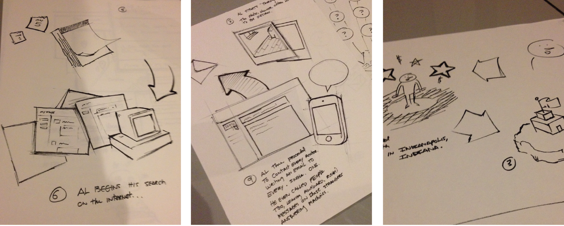
My research gave me invaluable perspective on the user and the market. This research revealed interesting problems that have not been solved by existing products.
I evaluated the offerings of similar products, enumerating their features relative to what users needed. I then classified their functions in terms of a Kano Model which allowed me to identify opportunities to differentiate.
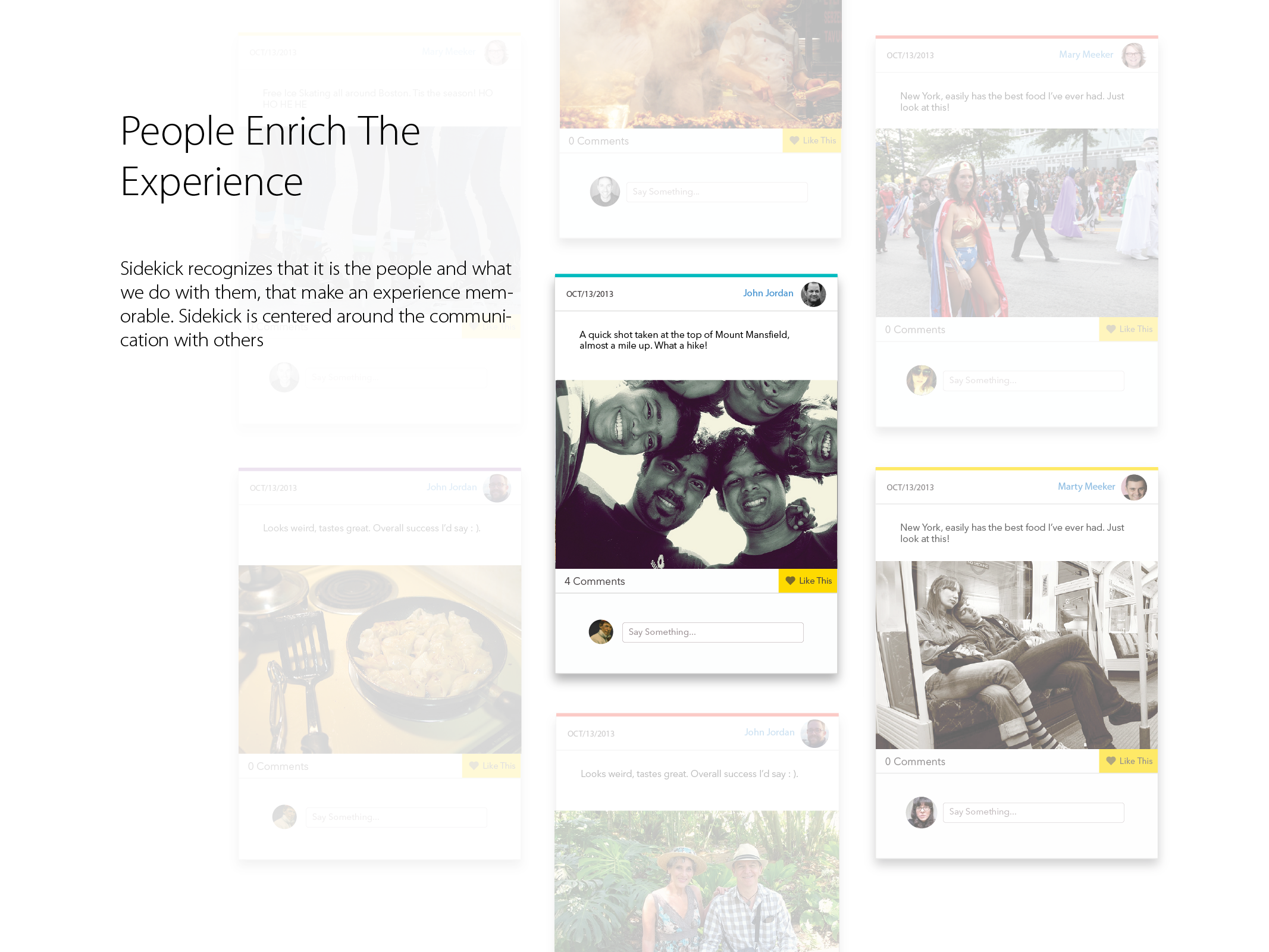
During my research I had determined that most people were experiencing very little trouble finding a place to live, but had trouble establishing themselves in their new home. Most respondants noted that they much prefered living with people that shared similar backgrounds and interests. This helped establish trust between them, and greatly enriched their experience.
An Identity
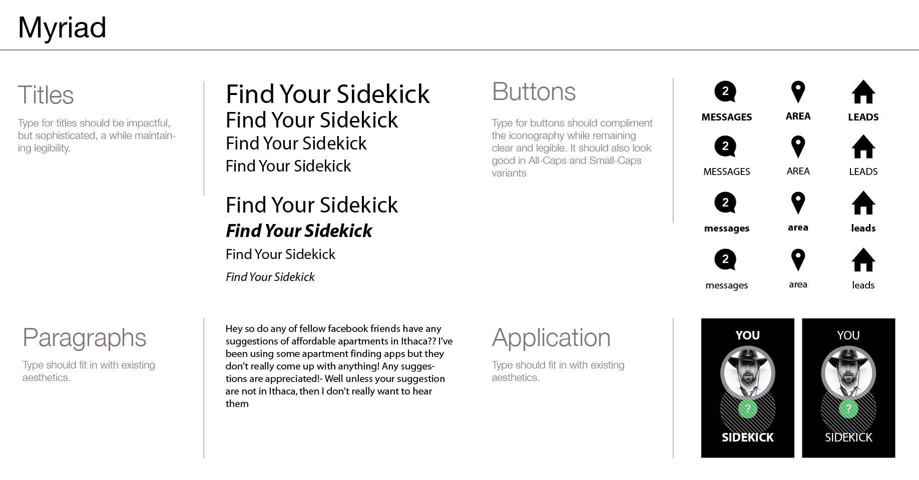
Because of the nature of this project, I considered the identity within the context of the product itself, looking for ways to create a meaningful, coherent system that would find its way into many aspects of the product, enchancing the user experience, and strengthening the identity itself.
I knew I wanted the identity to appeal to a rather narrow demographic, that being 18-25 year old, young professionals. Because of this, I wanted the identity to be approachable, trustworthy, young, and smart.
I started by first, evaluating numerous brands, trying to understand differentiating factors, and trends that could guide my exploration and design.

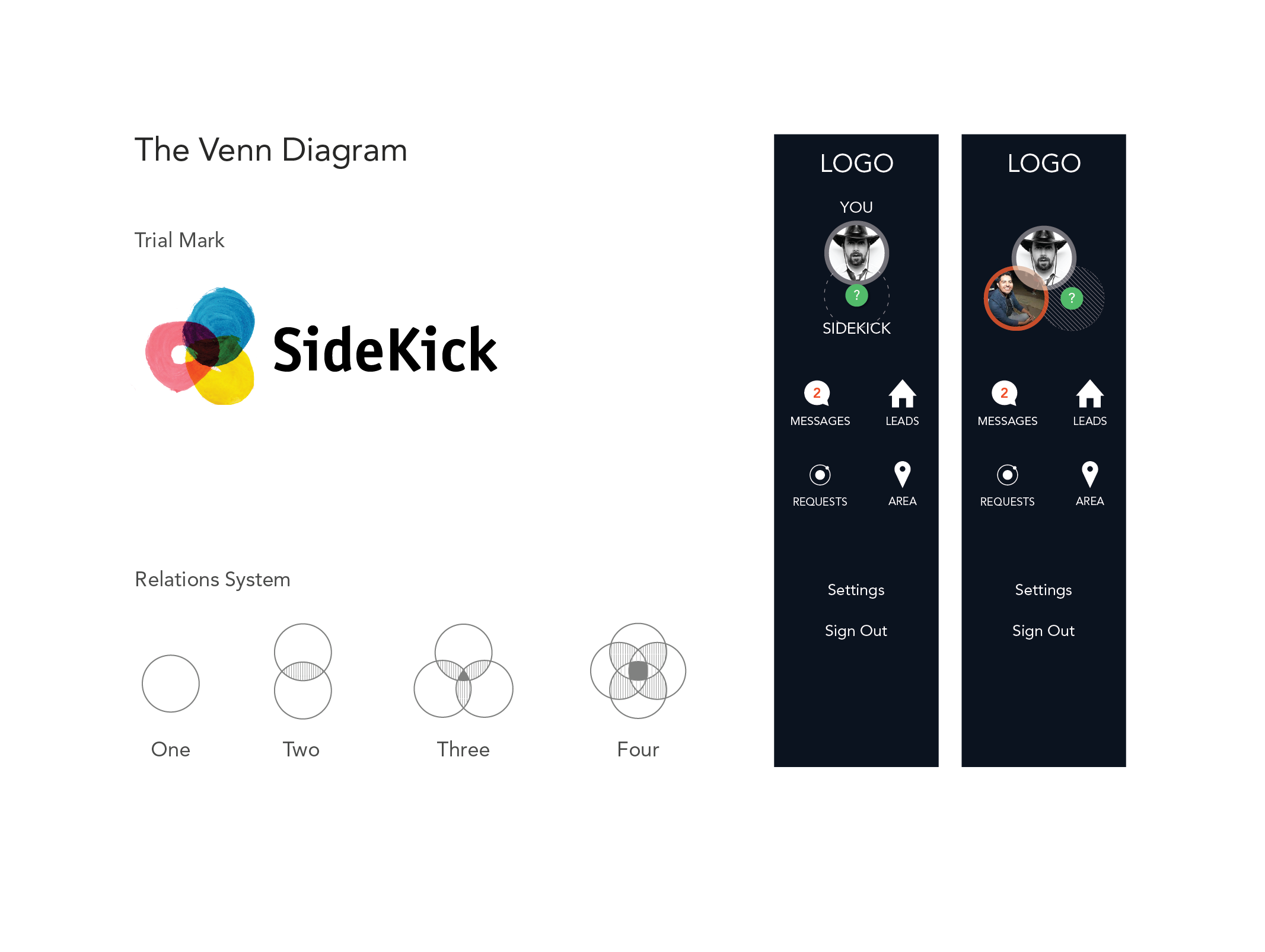
As part of this I had the idea of using a Venn Diagram motif throughout the system. This seemed to fit perfectly, as it represented the connections Sidekick aimed to foster, and it enabled a series of interactions that could help define the site's experience. For instance, one concept was to represent your "sidekicks" ( roommates ) with these venn diagrams, allowing one to add or remove people with a simple drag and drop.
After some experimentation I opted for a slightly more sophisticated look, painting the Venn diagram with watercolor. I continued with this identity for awhile, but finally decided that it didn't fit the product, or the audience, appearing too sensual and mature.
Interaction
Because of the short timeframe I had to complete this project, I reduced the scope of the design from the whole product, to some key features. Never the less, the design speaks to the overall aesthetic and user experience of the site.
My first step during the design was to create wireframes for the various pages, while still exploring options for navigations, and site structure. Because I wasn't designing the entire product, I didn't do a thorough job in specifying the information architecture. This was, in retrospect, a mistake, for none of the features or decisions could live out of context. Without the underlaying structure, I found each decision to be arbitrary, and it wasn't until I was able to establish a system for the product, and mental model for the user did I make significant progress on the design.
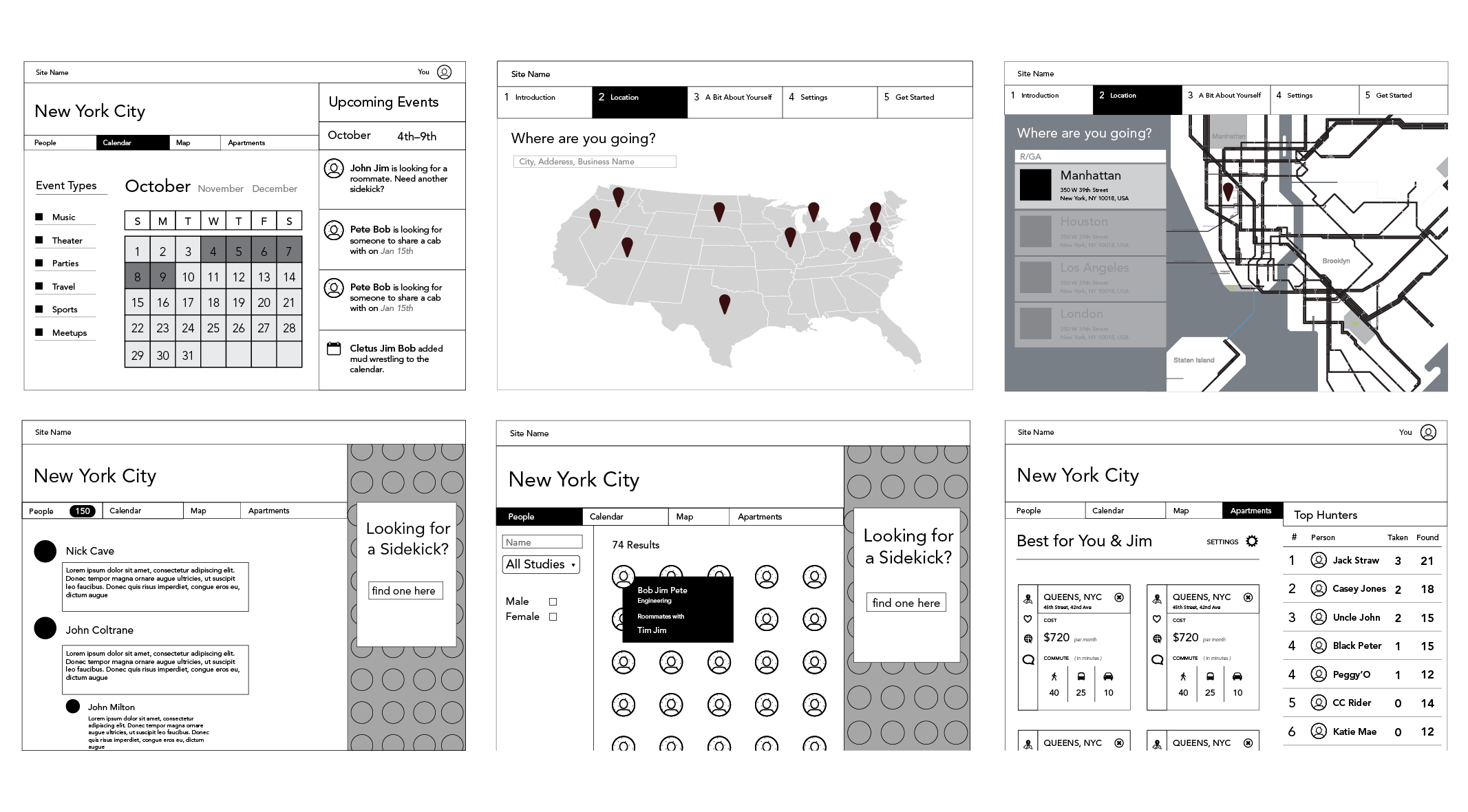
Because the proposed product was so complex, I found myself having to make choices regarding the relative importance of features. One unique component of this product is the "matching" feature that pairs a person up with a sidekick. A feature like this, which is very reminiscent of online dating, must be handled with care and executed properly, lest we give the user a mistaken impression of the service.
In a similar vein, how important was the location aspect, and how much did it need to be emphasized? I felt that this was a large differentiating factor and it allowed for different ways to interact, giving you an idea of where your peers worked relative to you, what they were doing, and where they lived. This "sliding window" allowed for a selective lens on what you were going to be view, and this lense was inherently relavant to you.
