The World's Marathons, Visualized
Twenty-Six is a visualization of the worlds' marathons. It looks closely at the runners of these races, and the courses' affect on their performance. This visualization looks at over 8 separate variables that make up a marathon, including:
- Runner Age
- Runner Gender
- Runner Nationality
- Runner Pace
- Runner Splits
- Marathon History
- Weather
- Elevation
The Data
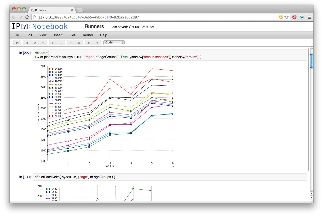
To create this visualization I had to collect the data and analyse it in its entirety. At this point I hadn't landed upon any particular story I wanted to tell about the data. So, to better understand what I was working with, I turned to the wonderful SciPy environment to perform quick, painless visualization and analysis of the data.
After exploring my data for awhile, I found a few interesting trends that I eventually opted to highlight in the visualization.
-
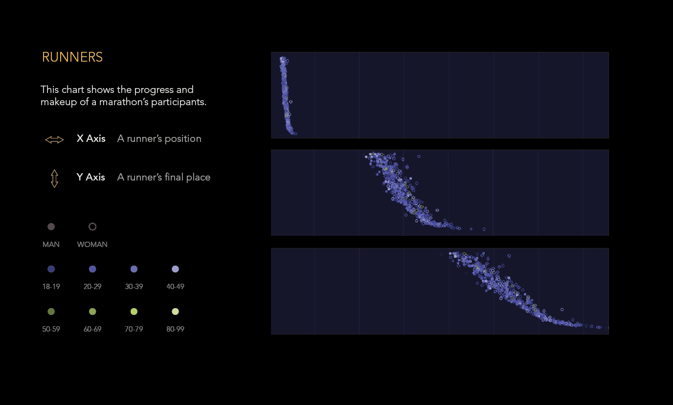
For elite runners, men hit their peak performance in their late 20's to mid 30's. The same is not true for women however, as they tend to reach peak performance between early to mid 20's.
-
For average male runners as a whole, there is little change in average performance between their late 20's and mid 50's. Again, the same is not true for women, as their performance tends to get worse as they age past their late 20's.
-
Elite runners are able to maintain very steady paces throughout the duration of a marathon. On average, the difference between an Elite runner's split is plus or minus 10 seconds. Furthermore, this is true regardless of the course, whereas one sees the average runner heavily affected by terrain and heat.
-
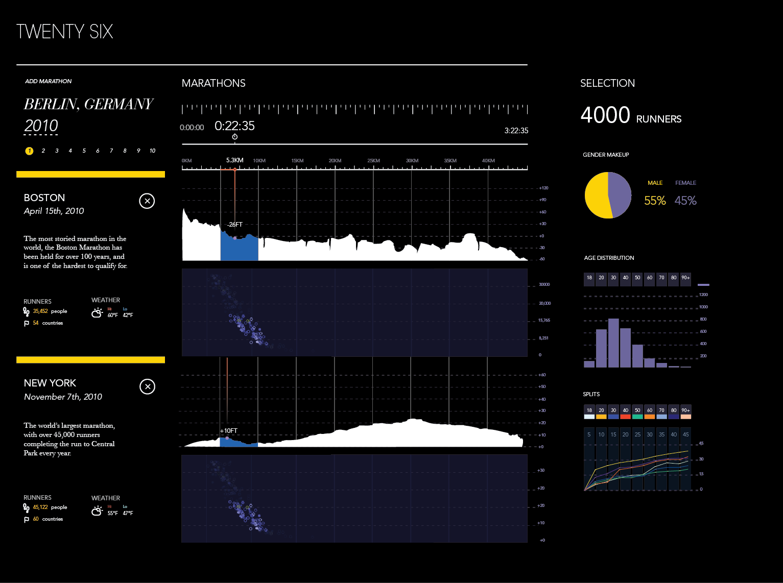
Some of the most famous and storied marathons are surprisingly tame when compared to others around the world. I had started this project with the impression that the Boston Marathon was one of the hardest and most grueling marathons in the world, but I quickly found that to be false. The course is mostly downhill ( from the start to the end, it drops 459 feet ), straight ( wind can help immensely ), and generally features fairly pleasant weather.
The Design
I wanted to design a visualization that was attractive, rich of information, intuitive, and fun. While the timeframe for this project was relatively short ( 3 weeks ), I went through multiple concepts, trying to achieve the best possible mix of educational value and fun.
Initially, I had planned on creating an interactive 3D representation of the marathon course, allowing users to compare and constrast the geography of the course itself and learning about the effects of temperature, elevation, and wind on marathon runners. You can play with the prototype yourself, here ( warning: because it is 3D, it requires a modern browser, and fast computer! ).
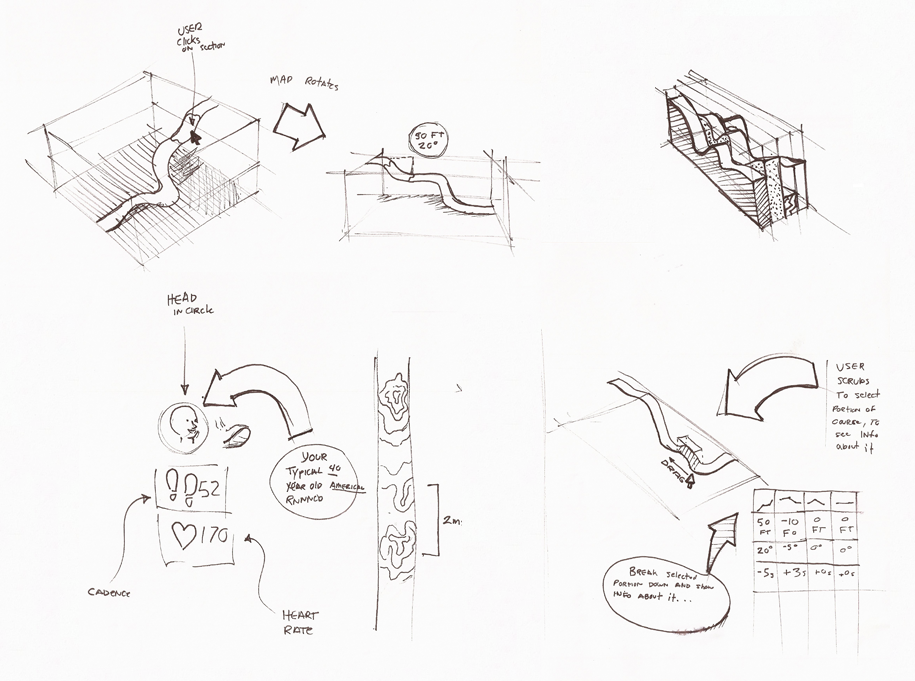
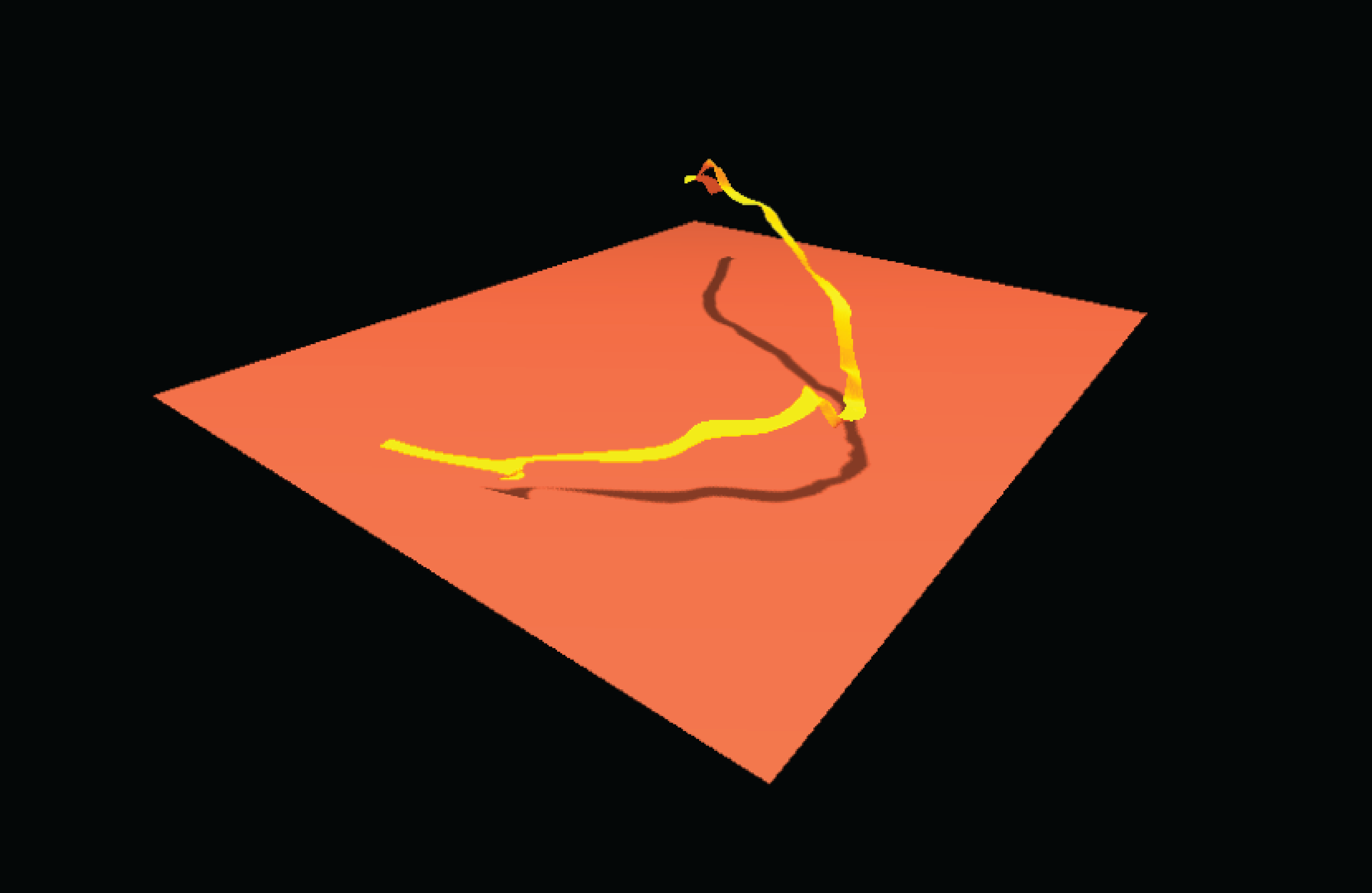
I prototyped this over a weekend to test the feasibility of such an idea, and to get a feel for what the data actually looked like. This direction appealed to me because of its potential to engage the viewer, and its highly interactive nature. With that said however, I eventually decided to take a different route because the difficulty to develop a polished piece, and because I felt 3D wasn't best suited for expoloring the kind of data I was presenting. For any effective visualization of this kind, comparisons must be made, and navigation must be obvious.
I then landed on the 2D linear approach, that became my final. I went this route because it allowed for easy exploration of the dataset, while also displaying multiple traits of the marathon.
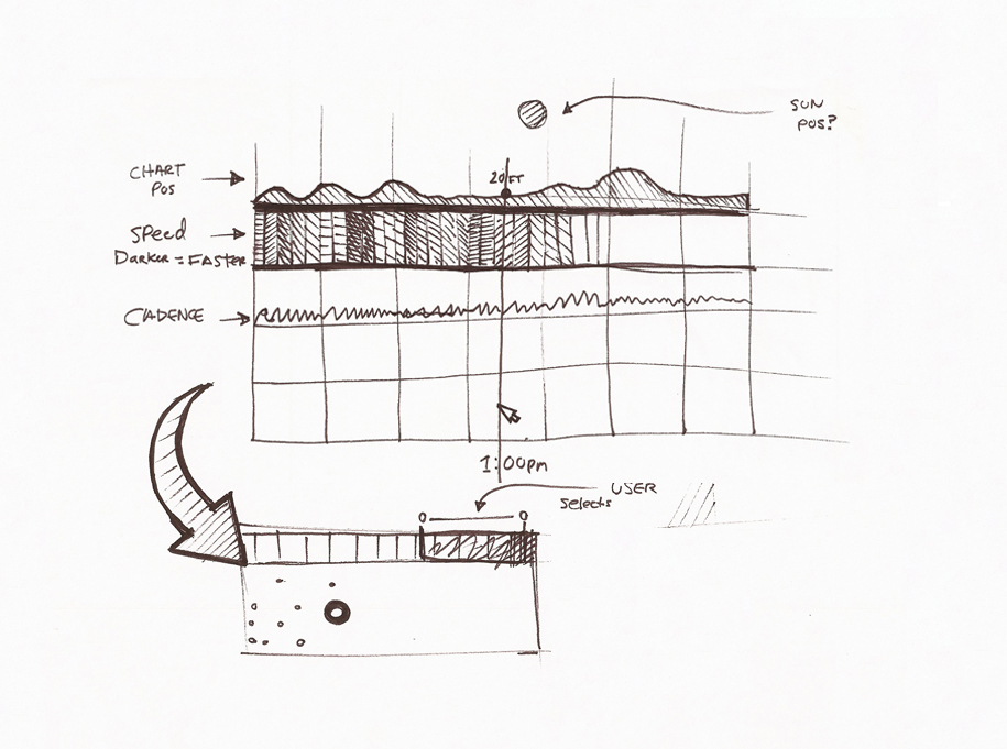
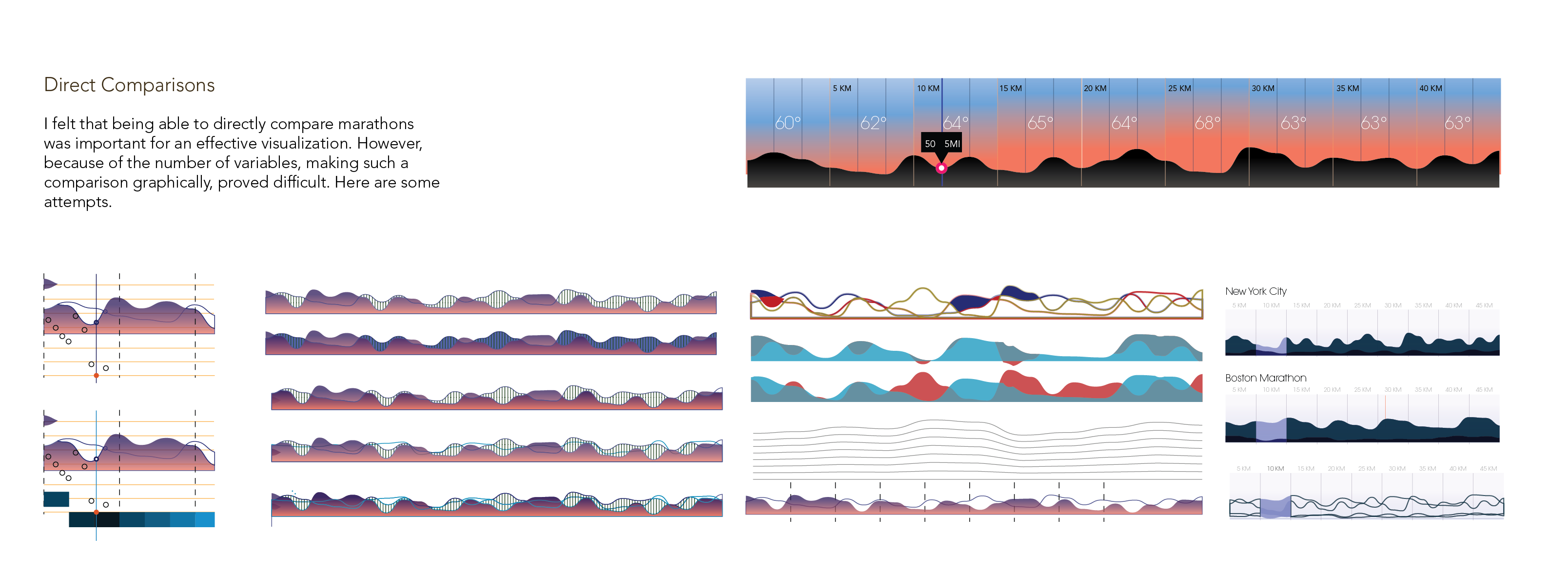
One difficulty that I experienced while designing this was ensuring ease of comparison between multiple marathons. How does one relate two different courses on two different scales? This was a problem I devoted much effort to, leading me to devise a few strange and rather esoteric ways of controlling the visualization. After attempting many different approaches, I finally opted for the less ideal, but more pragmatic approach you see in the final design.
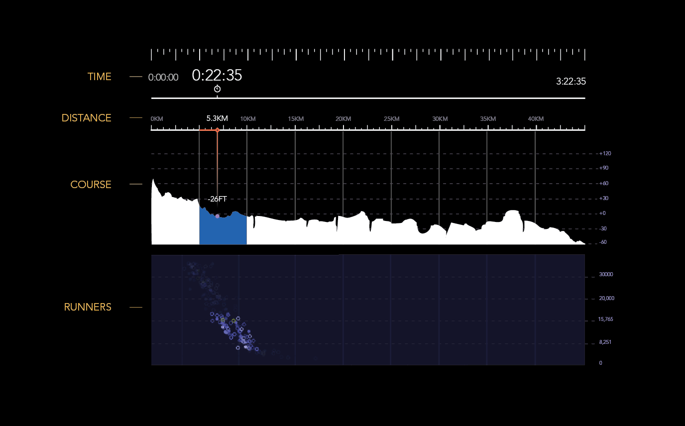
Much thought was also given to how the different components relate to one another. With this visualization, you can at a glance, get a decent idea of the difficulty of a course, as suggested by its elevation profile. This of course affects the performance of runners, and therefore, a connection must be made.
To accomplish this, I placed a plot showing all of the runners beneath the elevation profile. These two charts are linked by a single continuous time scale that represents the speed of the average runner in the race.